Reading the Metro Map
Washington's rail system is unusual among American subways in that it was designed all at once, as a single object. Most older networks are accretions: competing private companies, absorbed and stitched together over decades, leaving behind mismatched platforms and awkward interchanges. Metrorail opened in 1976 with a finished architectural language already in place, and the diagram that hangs in every railcar is the picture of a plan rather than the record of a settlement.
That origin explains most of what a newcomer finds confusing about the system, and most of what is genuinely good about it.
One room, repeated
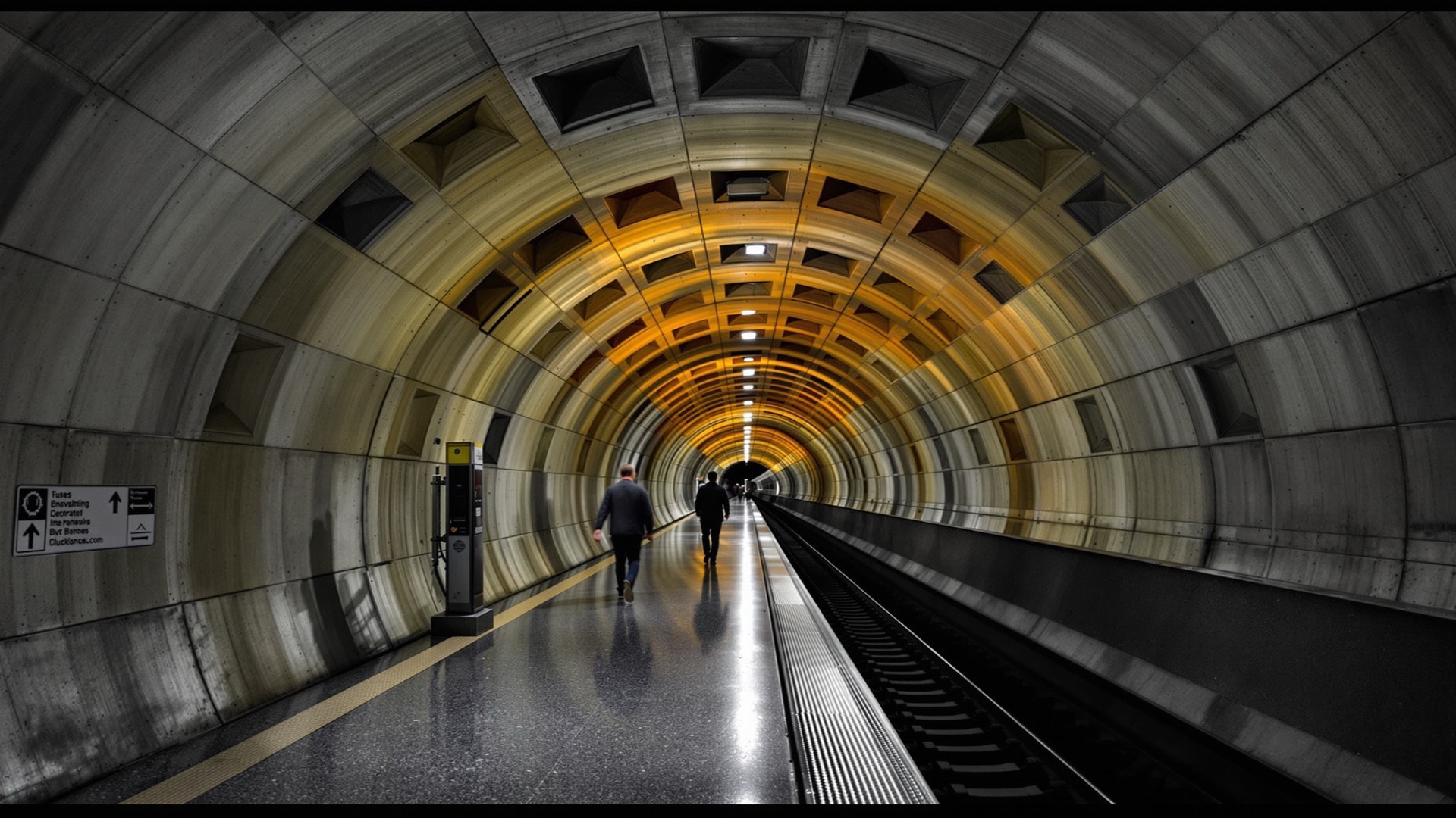
The system's architect was Harry Weese, and his governing decision was to treat the whole network as one continuous civic interior rather than as a series of individually decorated stops. The deep stations are bored vaults, their concrete ceilings cast in a grid of deep coffers that runs the length of the platform. Nothing is applied over them. There is no tile mural, no local theming, no advertising panel on the vault itself.
The lighting follows the same logic. Light comes from coves at the platform edge and behind the mezzanine, thrown upward at the coffers so that the vault does the illuminating. The result reads as a room rather than as a tunnel with fixtures hung in it. Station names are carried on freestanding pylons out on the platform, which is why they can be hard to catch from inside a moving train: the information lives on the furniture, not on the walls.
Not every station is a vault. Shallower ones use a coffered flat slab or an arched box, and the outer stations are open-air platforms under canopies. The kit of parts changes with the engineering, but the family resemblance holds, and that is the point. A passenger is meant to know they are in the system, not to identify the station from its decoration. Whether that is austere or dignified has been argued in this city for fifty years, which is a fair sign that the architecture is doing something.
Six lines, fewer routes
There are six lines - Red, Orange, Blue, Yellow, Green and Silver - but there are considerably fewer than six independent paths through the center of the city. The Red Line is the exception that makes the rule: it holds its own pair of tracks for its full length, running as a long hook with both ends in the Maryland suburbs and the bend passing through downtown.
Everything else braids. Orange, Blue and Silver run together on one pair of tracks across the core; Yellow and Green share another. This is the single most useful thing to understand about how often trains come. A shared segment has a fixed capacity in trains per hour, and every line running through it draws from the same allowance. A line sharing track with two others cannot be scheduled as generously as one that shares with nobody, however much demand sits on its outer branch. The constraint is not the branch. It is the tunnel that everyone has to fit through.
It also means service decisions propagate. Rerouting one line to relieve a crowded segment necessarily changes the wait somewhere else, which is why the operating pattern through the core has been revised repeatedly rather than settled once and left alone.
What the diagram does not tell you
The map is a schematic in the tradition that begins with the London diagram: straight lines, fixed angles, even spacing between stops. Geography is traded away for legibility, and the trade is not applied evenly. Downtown, where stations sit close together, the diagram pulls them apart to make room for labels. At the outer ends, where stations can be several miles apart, it compresses them.
Two consequences catch visitors out. The first is that a trip which looks long on the map may be short on the ground, and the reverse. The second is that the map shows no streets at all, so it cannot show the many occasions when walking beats riding. In the central city, between two stations on different lines, walking very often does. The Washington street grid is legible enough that a stranger can navigate it above ground on the first day.
The suburban bargain
Metro was built as a regional system rather than a city subway, and a large share of its length lies outside the District entirely. That was a political condition of getting it built at all, and the consequences are now studied in both directions by regional planners and by the National Capital Planning Commission.
Where a jurisdiction put its stations under a commercial street rather than in a highway median, and then zoned for height around them, the outcome was a real reshaping of the suburb: mid-rise corridors of offices and apartments tapering back into unchanged single-family blocks two or three streets away. Where a station was dropped at the edge of a highway with a parking structure attached, the station remained a parking structure. The rail alignment did not decide this. The land-use decision taken alongside it did.
The Silver Line
The newest line opened in 2014 and was extended in 2022 out through Tysons and Reston to Dulles International Airport and on into Loudoun County. It is the clearest modern test of the same bargain: an elevated alignment through what had been an office-park landscape, paired with rezoning meant to convert that landscape into something walkable over a generation. The conversion is underway and unfinished, which is the honest way to describe it.
The repair years
Any account that stops at the architecture is incomplete. The system was built quickly, aged all at once, and for years deferred the reinvestment a network of its size requires. Serious safety failures in the late 2000s and again in the middle of the 2010s forced the issue into the open.
What followed was long and disruptive. An accelerated maintenance program beginning in 2016 closed segments of line for weeks at a time to rebuild track, followed by successive summers of similar shutdowns. An independent regional safety commission was created with real authority over the operator. In the early 2020s an entire class of railcar was withdrawn from service after a wheel defect was identified, thinning service across the network for months. None of that was cosmetic and none of it is entirely behind the system. Reliability is far better than at its worst and remains the region's loudest transportation argument.
Transferring, and the distance between names
Two habits save a visitor most of the trouble.
The first is to read the destination shown on the train rather than trusting the platform, because on a shared segment several lines use the same platform in the same direction, and the wrong one will carry you correctly for four stations and then turn.
The second is to treat station names as approximate. Adjacent stations on different lines can carry quite different names while sitting a block or two apart at street level; the pair serving the office district west of the White House is the standard example, and walking between them above ground is frequently faster than riding around to a formal transfer point. Downtown blocks are short and the sidewalks are well maintained by the District Department of Transportation, so the quickest connection is often the one the map declines to draw.
For where the lines actually take you, see our neighborhood guide, or the walk from the U Street stations through Shaw and the U Street corridor. The full index of guides collects the rest.